Meet Our New Logo & Look
Two years ago, we embarked on a learning journey through our Strategic Planning process to reevaluate who we are as a community and the impact we want to have on the world.
The result was a more holistic understanding of our work in terms of Homes, Health, and Voice and a deeper understanding for our need to become an anti-racist organization.
In this moment of learning, it became clear that the way we visually represented TNDC at the time—centered on housing—would also need to adapt to better reflect our work and our growing community.
And so the search for a new logo began.
Our Process
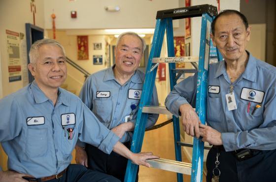
One of our new logo’s clearest needs was to better represent TNDC’s identity beyond being an “affordable housing developer.” While we remain a leading affordable housing developer in San Francisco and continue to believe in a housing-first model, our belief is that a home is so much more than four walls and a roof. A house becomes a home when the person or family living there has their basic needs met, like food and being heard about the issues impacting them.
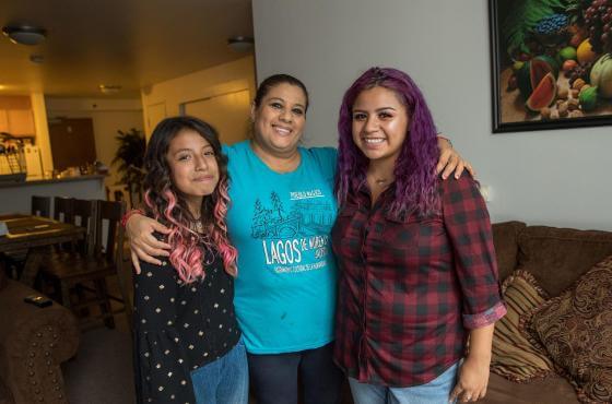
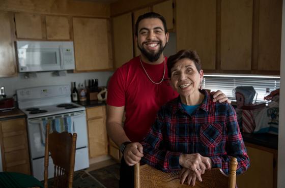
Above all, a home is a community. The people living in each of our buildings build a vibrant, unique space for each other, and our role is to be in service to that community.
In order to honor that vibrancy, we participated in a deep and inclusive design process.
Through a combination of facilitated group brainstorms, surveys, individual stakeholder interviews, and organization-wide discussions, we worked together, co-designing how to most successfully manifest our core values visually.
Every step of the way, we provided general “directions” for the new logo, helping us to pinpoint the specific design elements, colors, and styles that resonated the most.
Our New Logo & Look
Throughout the process, we learned more about who we are and what we felt were the core parts of TNDC’s identity—forward-thinking, stability, building, transformative communities, dignity, equity, and unity. These are the words that guided us to our final design.
- A more inclusive color palette that celebrates the different cultures, races, genders, languages, sexual orientations, income levels, and ages
- Individual colors that carry their own symbolism:
- Blue for strength and history
- Teal for modernity and forward-looking
- Green for growth and transformation
- Red for boldness and action
- Yellow for warmth and optimism
- More community-centered visuals:
- Abstract depictions of buildings sitting under an arch of unity, support, and collective transformation
- Overlapping shapes used as a metaphor for people with differences coming together as one, and the intersections of Homes, Health, and Voice
- Approachable font:
- Montserrat is a warm, friendly, and modern font
- Lowercase letters signify humility and a willingness to be in service of others
With our values so carefully woven into the design, we couldn’t be prouder of the result. Thank you to all of our partners, stakeholders, and community members who participated with their time and thoughtfulness throughout this process.
We hope you’ll take a moment to watch a new animation about Homes, Health, and Voice, explore the new website you're on—built to center the people who use it most—and feel pride in the work you make possible every day.
Thank you for being a vital part of the TNDC community.